
How to Choose Curtain Colors That Perfectly Match Your Home Style

The color of curtains is not a small thing in home decoration, rather it decides the mood of the entire room. Many times I see that people choose the color of the walls very thoughtfully and also bring the furniture according to the style, but when it comes to curtains, they choose any color in a hurry. Later the same curtains spoil the beauty of the room.
Many people think that curtains are just to block sunlight, but to be honest, it sets the mood of the room. The right color curtains can make a room look bigger, brighter and more relaxing, while the wrong color can make a room look smaller, heavier or mismatched.
If your room is small then light colored curtains can make it look open and bigger. In a big room, you can make it more cozy and classy by installing dark colored curtains. Light colors give peace, dark colors add depth and a royal feel, and printed curtains add life to the room.
Many times we like a color after seeing it in the shop, but after coming home the same color looks completely different. This happens because lighting and surrounding colors change that shade.
Now I will tell you one by one how you can choose the right color of curtains, so that your home looks more beautiful and balanced.
1. First of all Look Carefully at the Color of the Walls of the Room
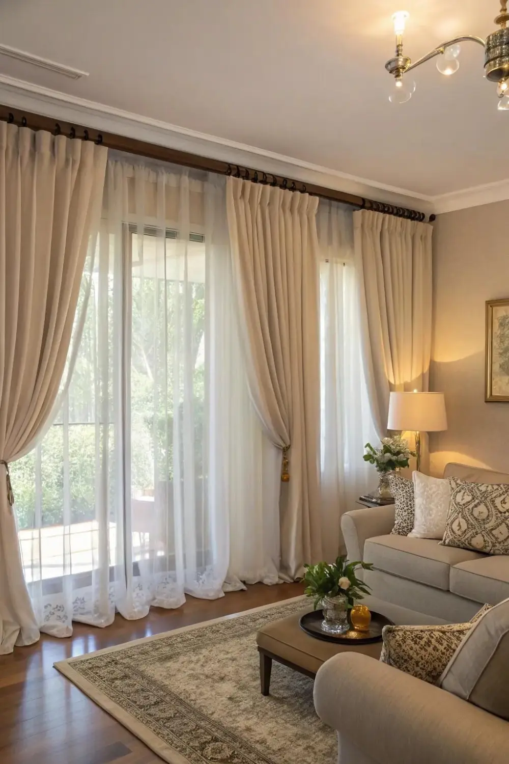
Whenever I choose a curtain color, I first look at the walls of the room carefully. Because the walls are the basis of the entire room.
First of all you should see whether the color of the walls is light or dark. If the walls are white, cream, light gray or pastel shades, you have many options. If you want, you can choose a slightly darker shade so that there is a slight contrast. This will make the room look more attractive. If you want a calm and soft look, you can also choose a shade similar to the wall color, just not exactly the same.
If the walls are already dark in color like brown, navy or dark green, then light colored curtains look better. This makes the room not look heavy and the lighting also looks better.
I always keep in mind that the color of the curtain and the wall should not be exactly the same. A little difference adds depth and beauty to a room.
2. Choosing Color According to the Size of the Room
When I choose the color of curtains, the size of the room is very important for me. I always ask myself—is this room small, medium or large? Because colors not only enhance beauty, but they also have the power to make a room appear bigger or smaller.
If the room is small, I avoid dark and heavy colors a bit. Colors like dark brown, maroon or very dark blue can make a small space appear smaller.
In small rooms I choose light and soft shades—like cream, off-white, light grey, pastel pink or soft blue. These colors reflect light and make the room appear spacious and airy. When the curtains are in the same shade as the walls, the room appears visually more spacious.
Whereas if the room is big, dark colors like navy blue, dark green or chocolate brown also look great in large rooms. Such colors make large spaces a little warmer and cozier. Sometimes a room that is too big can feel empty, and dark colored curtains give it a balanced and full look.
I always choose curtains considering whether the color will make the room look smaller or bigger.
3. Coordinate with the Color of the Furniture
When I choose the color of curtains, after the walls, I pay the most attention to the furniture. Because to be honest, the sofa, bed, chairs and table are the main parts of the room. If the colors of curtains and furniture are not in harmony, the room may look scattered and unbalanced.
The first thing I do is look at what tone my furniture is—light, dark, or neutral. If the sofa or bed is already a dark color, like dark brown, navy or maroon, I like to keep the curtains a slightly lighter shade. Due to this the room does not seem heavy and balance is maintained. For example, beige or cream curtains look very beautiful with a dark brown sofa.
If the furniture is a light color—like gray, cream, or white—I can add a little depth with curtains. In such a situation, a slightly darker or textured curtain takes the room from ordinary to something special.
And if the furniture is plain, then light design or print in curtains also looks good. This maintains a balance between the two.
The most important thing for me is that the curtains should not try to match the furniture, but complement it. When the two colors enhance each other, the entire room looks beautiful—like everything has been thoughtfully arranged.
4. Be Sure to Take Care of Lighting
Whenever I choose the color of curtains, one thing I never ignore is the lighting of the room. Light is the only element that can completely change any color. The color that looks very beautiful in the shop may look completely different in the different lighting of the house. That's why I always first understand how much natural and artificial light is there in the room.
In such a room, I can also choose a slightly darker color, because sunlight balances that color. Even dark curtains do not look as heavy in sunlight.
Cream, off-white, light gray or pastel tones reflect light and the room appears more open and bright.
I also see what kind of light is lit in the room at night—warm light or cool light. In warm light the color appears slightly yellow and soft, whereas in cool light the same color may appear slightly sharp. That's why I try to ensure that the color of the curtains looks good both during the day and at night.
If curtains are chosen with light in mind, the room looks more balanced, comfortable and beautiful. The combination of right light and right color creates the real magic.
5. Balance Between Patterns and Solid Colors
When I choose the color and design of curtains, the first thing I look at is how much pattern is already present in the room. If I have a printed cover on my sofa, a design on the cushions or a textured wall or wallpaper, I like to keep the curtains in a solid colour. This makes the room feel calm and balanced, and everything appears to be clearly in its place.
If the walls and furniture in the room are plain and neutral, I can add a light pattern to the curtains. But I make sure the print is not too big or too bright, otherwise the room may seem heavy.
I follow a simple rule—if two things are in a pattern, the third thing should be solid. This maintains balance in the decoration.
For me, the most important thing is that the room neither looks too empty nor too full. When patterns and solid colors match well, the home looks more beautiful and comfortable.
6. Put Your Preferences First
When I choose the color of curtains, I give importance to my choice first. I don't think about what others will like or what color is in fashion right now. I think about what colors make me feel relaxed, what shades make me happy.
Sometimes we change our mind due to what others say. But later we do not like the same color. That's why I listen to my heart first. If looking at a color makes me happy and relaxed, then that is the right choice.
The purpose of decorating the house is not to show off. The aim is to find peace of mind after coming home. When the color of the curtains is of your choice, the room looks more yours.
So always keep your choice first. Listen to the advice of others, but decide for yourself. This is the best way.
I definitely listen to the advice of others, but take the final decision from my own mind. Because when the color of the curtains is related to my choice, the whole room looks more my own. And to be honest, home is where our choices are clearly visible.
7. Maintain Color Coordination Throughout the House
When I choose a curtain color, I don't just think about one room. I also check whether the color matches with the entire house or not. For me, home is a connected place, where every room should feel separate yet connected.
For example, if I have chosen light beige curtains in the living room, I can choose a slightly darker shade of the same in the bedroom. In the kid's room I can add light colored accents with the same base tone. This creates diversity in the house and also maintains coordination.
I also look at what the overall theme of the home is—modern, minimalist, classic or traditional. The colors of the curtains should be in accordance with the same style.